Given the nature of Vision Quest's business and its diverse audience - including government, schools, VA, municipalities, first responders, independents, real estate companies, insurance companies, and non-profits - I developed four color schemes that reflect the company's ethos of growth, reliability, and support. The suggestions are based on principles of trustworthiness, professionalism, accessibility, and engagement.
The website for Vision Quest needs to provide information on their mission and services, focusing on personal and professional development with a range of programs designed to support individuals and organizations in achieving their goals.
Unfortunately, the YouTube link you provided didn't open, so I couldn't gather information from there.
We need to incorporate specific information about the business's services, target audience, or visual identity directly for the landing page.
COLOR SCHEMES
They are versatile and professional, aiming to appeal to the varied sectors Vision Quest serves.
My Preference - Modified - Professional and Trustworthy
- Navy Blue (#003366): Conveys professionalism and trust; suitable for government and corporate settings.
- Slate Grey (#708090): Neutral and versatile, providing a solid foundation for any design.
- Silver (#C0C0C0): Offers a modern, clean look that complements the primary colors.
- White (#FFFFFF): Ensures readability and creates a sense of space and clarity.
- Forest Green (#228B22): Evokes growth and prosperity.
Developing a brand around Color Scheme 1
which includes Navy Blue, Silver, Slate Gray, White, and Forest Green, involves creating a visual identity and messaging that reflect trust, professionalism, innovation, and growth. Here's a conceptual framework for the Vision Quest brand based on these colors:
Logo Design
-
- Primary Colors: Blue and Silver, to highlight professionalism and modernity.
- Accent Color: Green, to subtly incorporate the idea of growth and prosperity.
- Design Elements: A minimalist logo that combines a stylized VQ monogram with an abstract symbol representing vision or quest—like an eye or a path leading towards a horizon.
Typography
-
- Primary Typeface: A modern sans-serif font that is clean and easy to read, reflecting clarity and professionalism.
- Secondary Typeface: A more stylized sans-serif or a serif font for headings and important callouts, adding a touch of elegance.
Website and Digital Presence
-
- Overall Look: A clean, modern aesthetic with plenty of white space to make content easily accessible.
- Color Usage: Blue for headers and key texts to convey authority; Silver and White for backgrounds and UI elements for a sleek, modern look; Green for calls to action and highlights to draw attention to growth and progress.
Marketing Materials
-
- Print (when necessary – proposals): Business cards, brochures, and other materials would use a combination of all four colors, with Blue and Silver as the primary colors for text and backgrounds, and strategic uses of Green and White to highlight important information.
- Digital: Email newsletters, digital ads, and social media graphics would follow the website's aesthetic, ensuring consistency across all digital touchpoints.
Messaging
-
- Tone: Professional, yet inspiring and forward-looking.
- Key Messages: Focus on Vision Quest's commitment to helping individuals and organizations achieve their goals, emphasizing trust, growth, and innovation.
This brand identity aims to resonate with Vision Quest's diverse clientele by conveying a sense of trustworthiness, professionalism, and a commitment to growth and innovation. The color scheme and design elements work together to create a cohesive brand experience across all touchpoints.
TYPEFACE
For the Vision Quest brand, considering the desired attributes of clarity, professionalism, and a touch of elegance, here are some font recommendations:
Primary Typeface (Modern Sans-Serif)
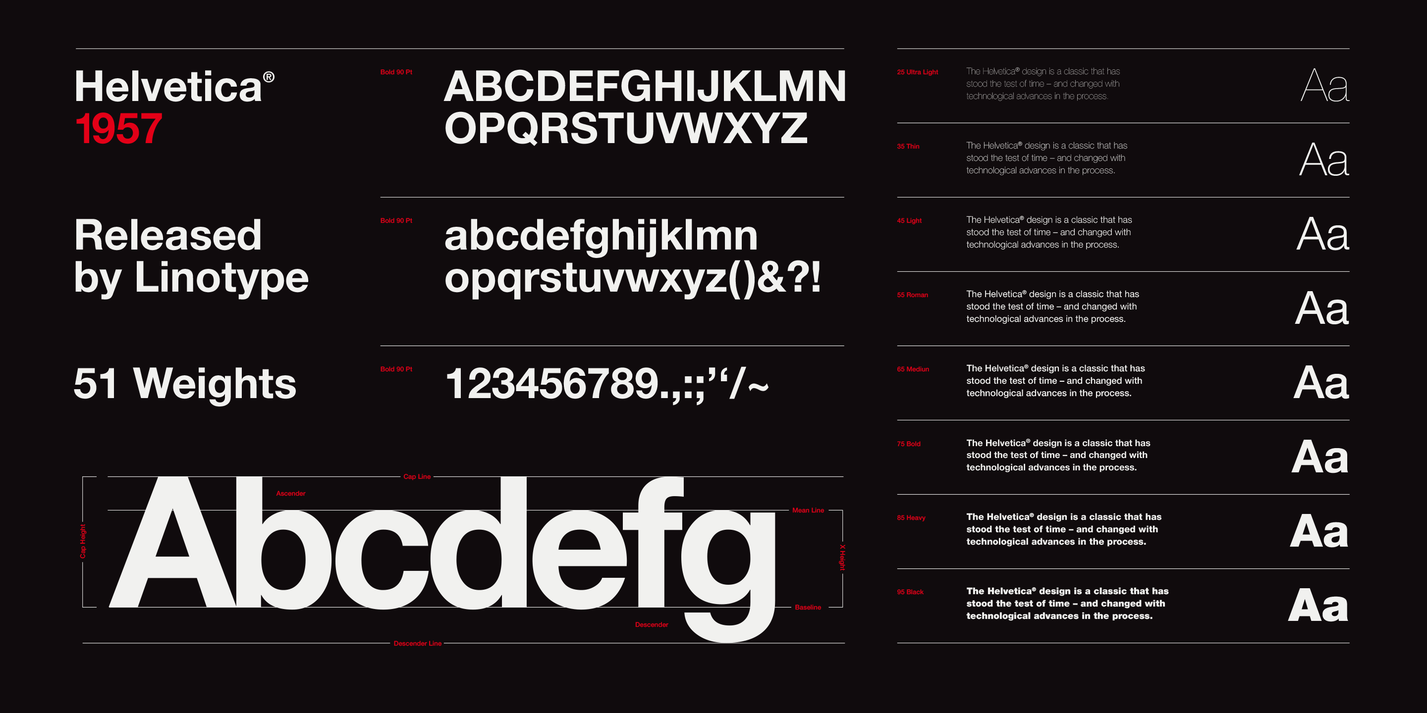 |
Helvetica Neue: A classic choice that offers a clean, modern look with great versatility in professional settings. |
Secondary Typeface (Stylized Sans-Serif or Serif)
 |
 |
|
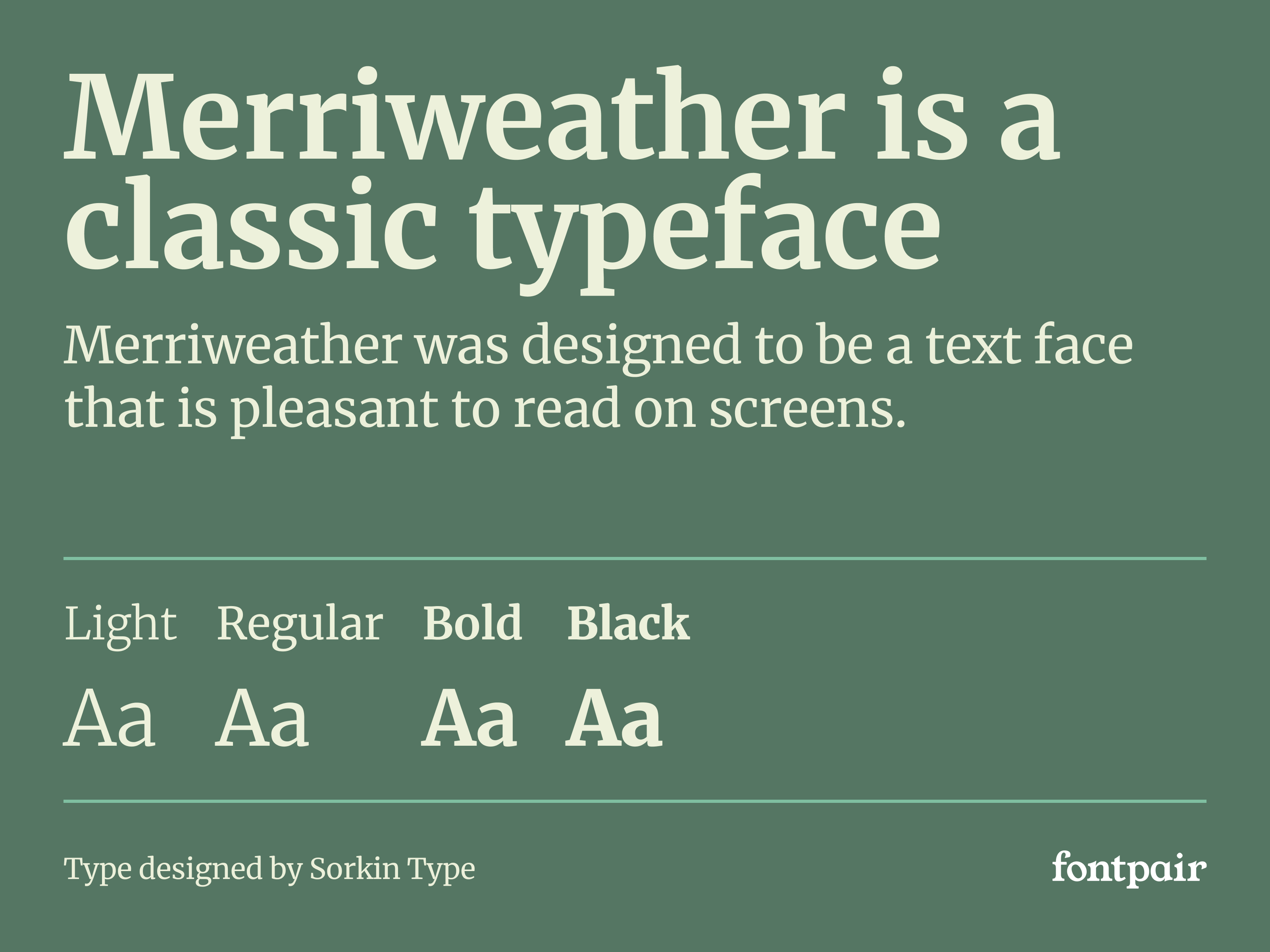
Merriweather:
|
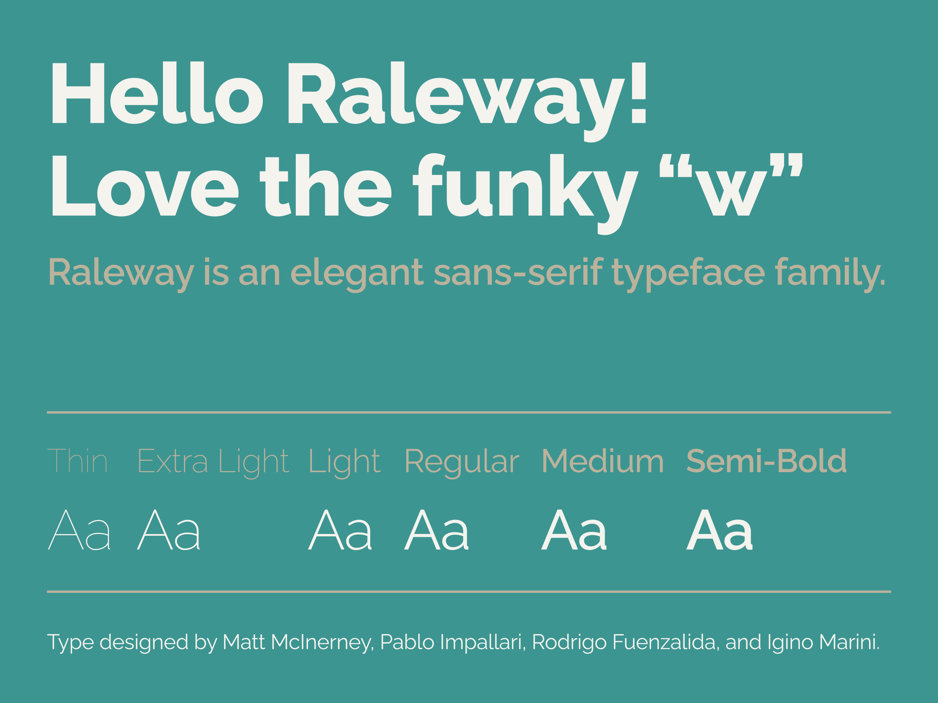
Raleway: |
These fonts can be mixed and matched to create a visually appealing and coherent brand identity for Vision Quest, aligning with its values of professionalism, innovation, and growth.